Tutorium was inspired by a 6 page tutorial that I created for my pottery students. Creating the tutorial was involved and fussing with the layout was tedious. It’s a lot of information for students to consume at once, but I was balancing priorities between fitting each step on one page (for easier use while throwing) without leaving out key information. I could see in my mind how I would lay this out if the tutorial was in an app and I could engineer the flow to provide just enough information on each page. It would be a much cleaner experience without losing any of the information.
Tutorials exist in many formats today. Blog tutorials offer the benefit of a self paced learning experience while YouTube tutorials allow users to fully see the process. The downside of YouTube is that, for some skills, the video moves faster than the user can replicate the task. It’s also annoying to fast forward through a long video trying to find the spot that clarifies the one portion you have a question about. Blog tutorials are easier to scan, but they are more labor intensive to make and there is no centralized location for these types of tutorials.
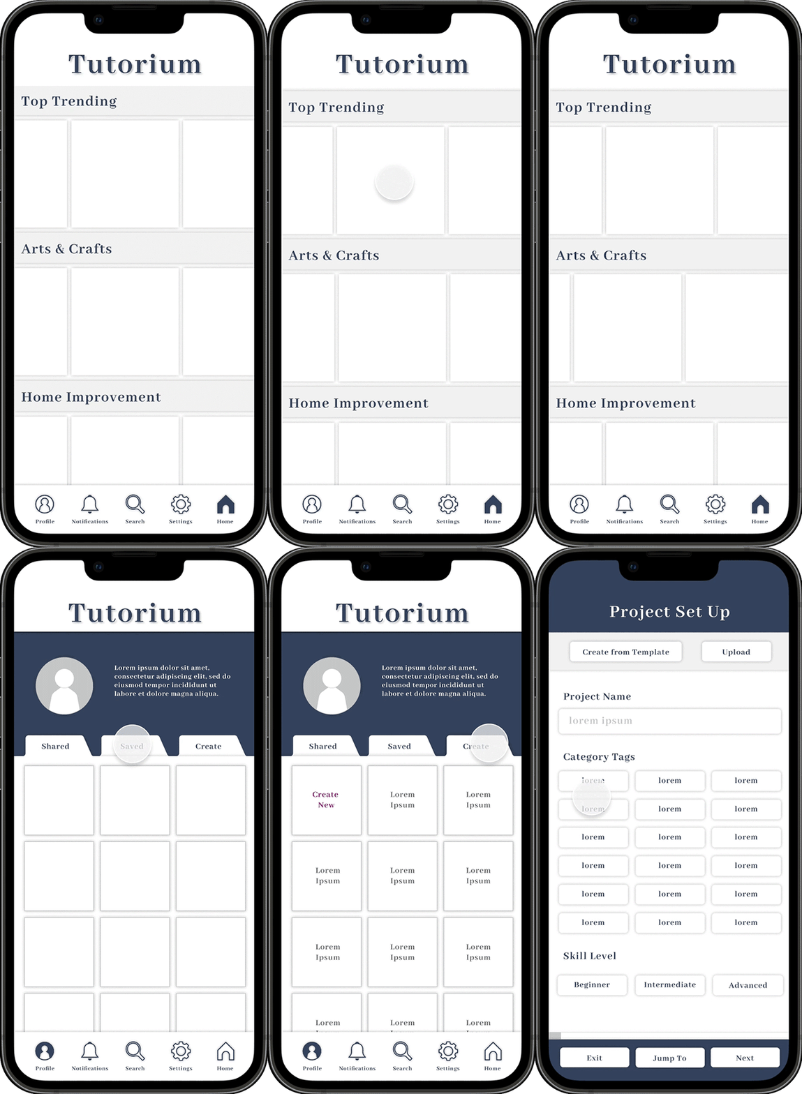
Tutorium was designed to solve for these frustrations. It was developed to be intuitive and engaging for both skill seekers and creators. It was created with community and inspiration in mind. The home page allows for easy browsing by topic. The user can scan for an interesting topic, then browse within that topic. Tutorials are showcased by a TikTok style video short. Clicking on a tutorial opens the video to full screen and allows the user to continuous scroll to view similar content.
The user’s profile has public sections showing what they have shared and what they have saved. These are browsable by both the user and their followers. The create tab is private to the user only. Under the create tab, users can create new or edit in-progress tutorials.
Concept Development
Ecosystem Map
As I worked through concept development, I envisioned an experience that combines the social strength of Instagram, the cataloging strengths of Pinterest, the easy to reference benefits of a blog style tutorial, and the data rich experience of a YouTube tutorial.
The process started with an ecosystem map. I worked through where Tutorium fit in the existing learning ecosystem. Tutorium was created for skill seeking users and skill share creators. It supplements available learning forums and tools and solves for challenges in the learning ecosystem. It was designed to work in collaboration with existing technology rather than as competition.
Personas
Tutorium has two main user groups: content creators and content consumers. Personas were created to understand both of these groups. For the purpose of this study, I chose to focus on the content creator experience. I was interested in exploring how Tutorium could make instruction content easy to create.
Journey Map
A user journey map allowed me to more fully understand the creator’s process and how the design can support her goals and tasks.
Story Map
A story map helped me break down the individual steps needed to create a tutorial and plan for the features that would be needed to support the content creator’s process. I showcased feature ideas with a lightbulb icon on top of the diagram. (For better resolution, click on the image.)
User Flow
A user flow helped me map the paths a creator could potentially take and start to visualize the flow. (For better resolution, click on the image.)
Key Features
As I worked through the concept process, I identified key features for the project set up flow and broke them out into pages.
Project set up
Allow the user to utilize templates or upload project details to save time on inputs that they have already created.
Incorporate category tags for SEO and in-app search.
Time Estimate
Some projects require multiple days or waiting time between steps. Prompt for this information to facilitate better end user experience.
Supplies and Tools
Incorporate optional referral linking into the project set up process to create seamless creator experience.
Monetization
Build seamless revenue streams into the app to create profitability for Tutorium and creators.
Steps
Separate the input of steps names and step descriptions to help creators focus on high level before getting into the weeds on details.
Collaborators
Allow creators to collaborate. They can use this feature to collaborate with other creators or with brands to create sponsored content. Give the primary creator control over what permissions co-collaborators have.
Take the stress out of sharing profits, by allowing creators to auto split any revenue.
Review Tutorial
Create a fully editable preview of the tutorial and allow creators to edit directly.
Media
Enable mass upload and mass edit. Incorporate robust design and editing tools that are accessible to those without design backgrounds.
Project Short
Facilitate end user engagement by utilizing project shorts - short format videos that are scrollable - to “sell” users on projects. These shorts should be sharable on other platforms to promote individual projects and draw new users to Tutorium.
Share
Allow creators to send draft tutorials to collaborators for comments if desired.
Design Development
The development included 3 rounds of iteration.
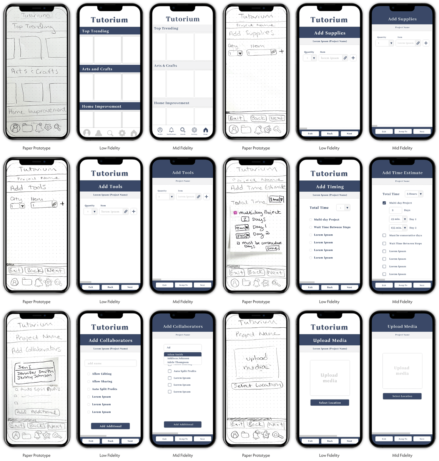
The first round was a paper prototype. This allowed me to quickly sketch out ideas and explore the flow and interactions.
The second round was a low fidelity prototype. In this stage, I focused on initial layouts for each of the pages and overall flow. As I moved through the process, I realized my initial idea for the profile page wasn’t flowing well. I revised to the 3 tab layout with shared, saved, and create sections. I also removed the icon navigation from the bottom while in the project set up flow. I felt it wasn’t necessary and ran the risk of a user accidentally hitting an icon and exiting the flow.
The third round was a mid fidelity prototype. In this stage, I focused on refining the design. I changed the font, adjusted elements that were cut off by the screen corner radius, refined the navigation icons, and removed the Tutorium logo from the project set up flow. I also built out the interactions and revised the bottom navigation to allow the user to “jump to” the section of their choosing.
Paper prototyping process
“Jump To” interaction
Market Opportunity
Business strategy and brand positioning are some of my key analytical strengths and this project was grounded in both. The microlearning market is growing, but it’s not huge in relation to other business sectors. However, I believe the market is larger than projected. Due to TikTok and Instagram, microlearning has become a standard, if not subconscious, way that users are learning new information. Almost 60% of the world population uses social media and people spend nearly 2 and a half hours a day on these platforms. The annual market volume in the social media sector is roughly $186 billion. Facebook claims the lion’s share of the market, however, younger generations are much less likely to use this platform, so we could expect that to decrease over time. Getting even a 5% share of this market would make Tutorium competitive with the likes of Pinterest.
Microlearning is already happening on social media, but the experience is fragmented and not conducive to learning skills that require supplies or preparation. There is an opportunity to create an experience geared specifically toward learning and Tutorium was developed specifically to fill that need.


